
Selected work
Crossfit Dalston
Logo design
An urban identity for a neighbourhood gym.
Crossfit Dalston Logo
01
The brief
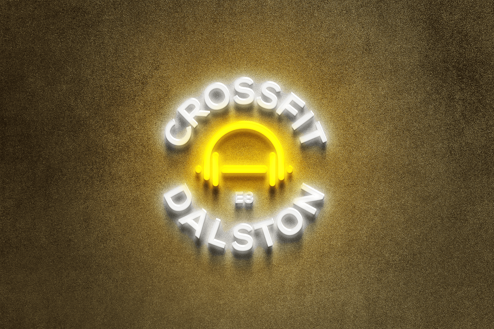
A local CrossFit gym in Dalston needed a logo with a clear sense of place and personality. The brief called for a dynamic, modern emblem that reflected the urban character of its community. The starting point was the gym itself: a physical space with a shared identity, rather than an anonymous fitness brand.
CrossFit Dalston Neon
02
The central idea
The chosen concept brings headphones and a dumbbell together in one mark. Each element is familiar on its own; combining them gives the gym a recognisable visual idea. The connection between music and training provides a direct way to express the energy of the space without relying on a long explanation.
Crossfit Dalston exterior signage
03
From mark to environment
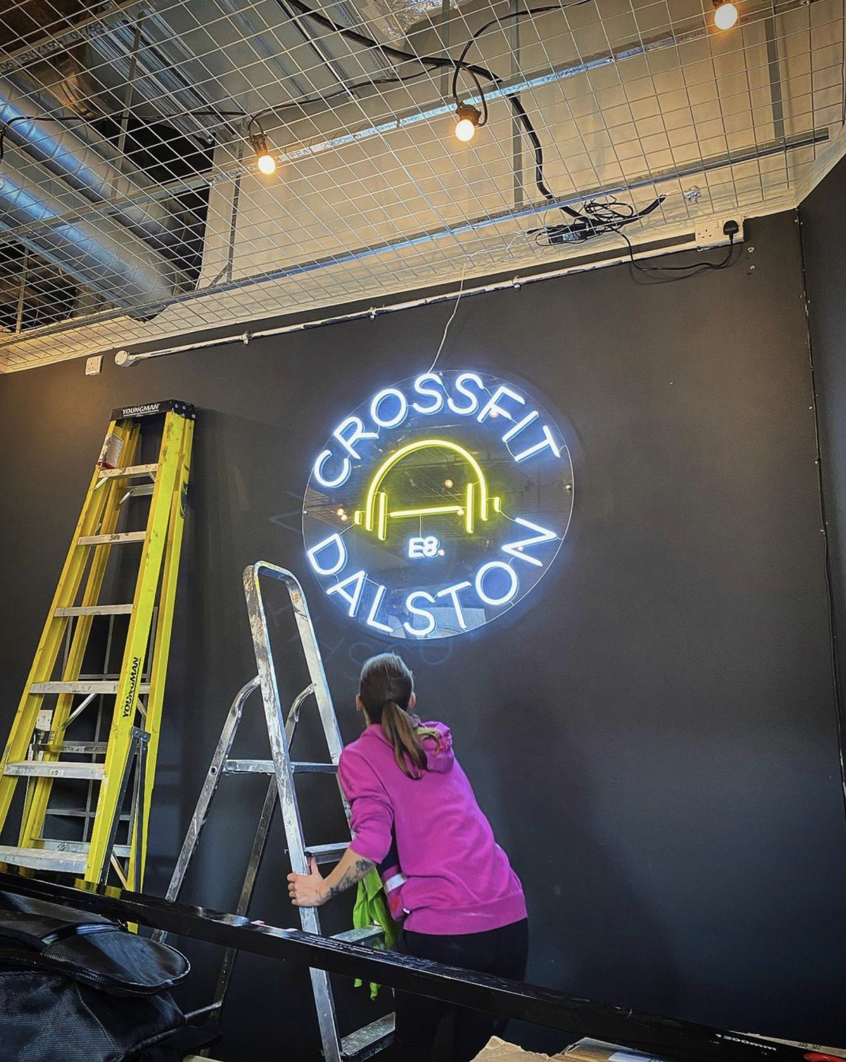
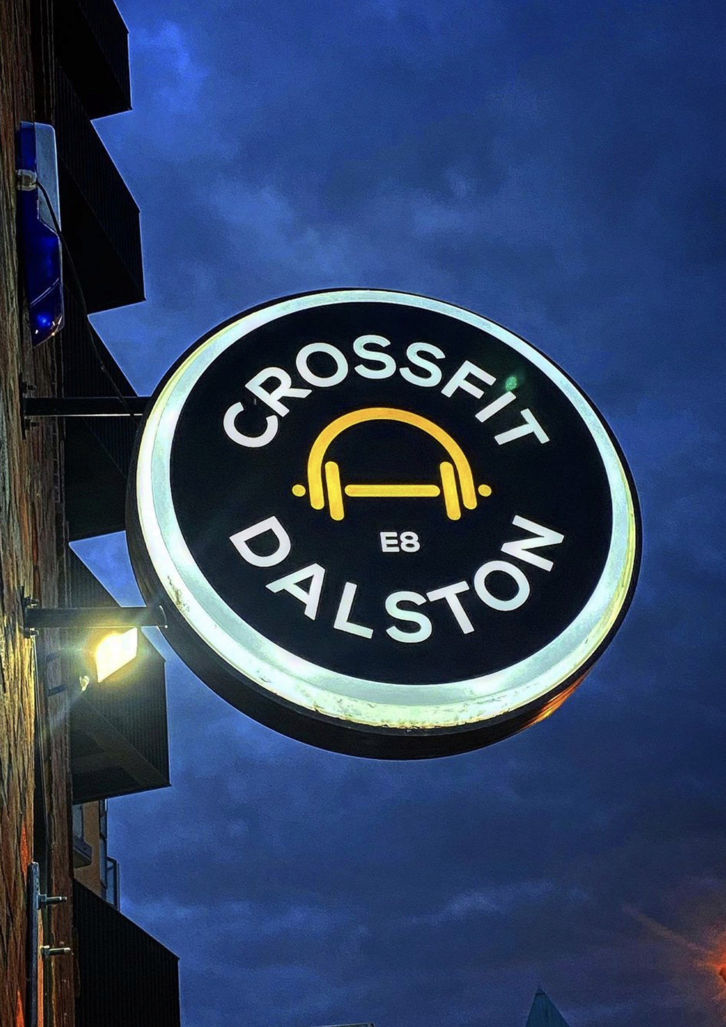
The published applications place the identity in the world of the gym, including neon and exterior signage. These are useful tests for a logo: it needs to read as a compact shape and still hold its character when enlarged. Looking at the mark in context makes the relationship between the business, its space and its audience clearer.
04
The work in view
This case study focuses on the logo and the environmental applications shown here. Together they demonstrate a single visual idea carried across different materials and settings. The result is presented through the design itself: a distinctive emblem with a direct connection to the gym’s identity.