
Selected work
Chop Chop
Naming, brand identity & packaging
Giving an everyday kitchen essential a name and identity of its own.
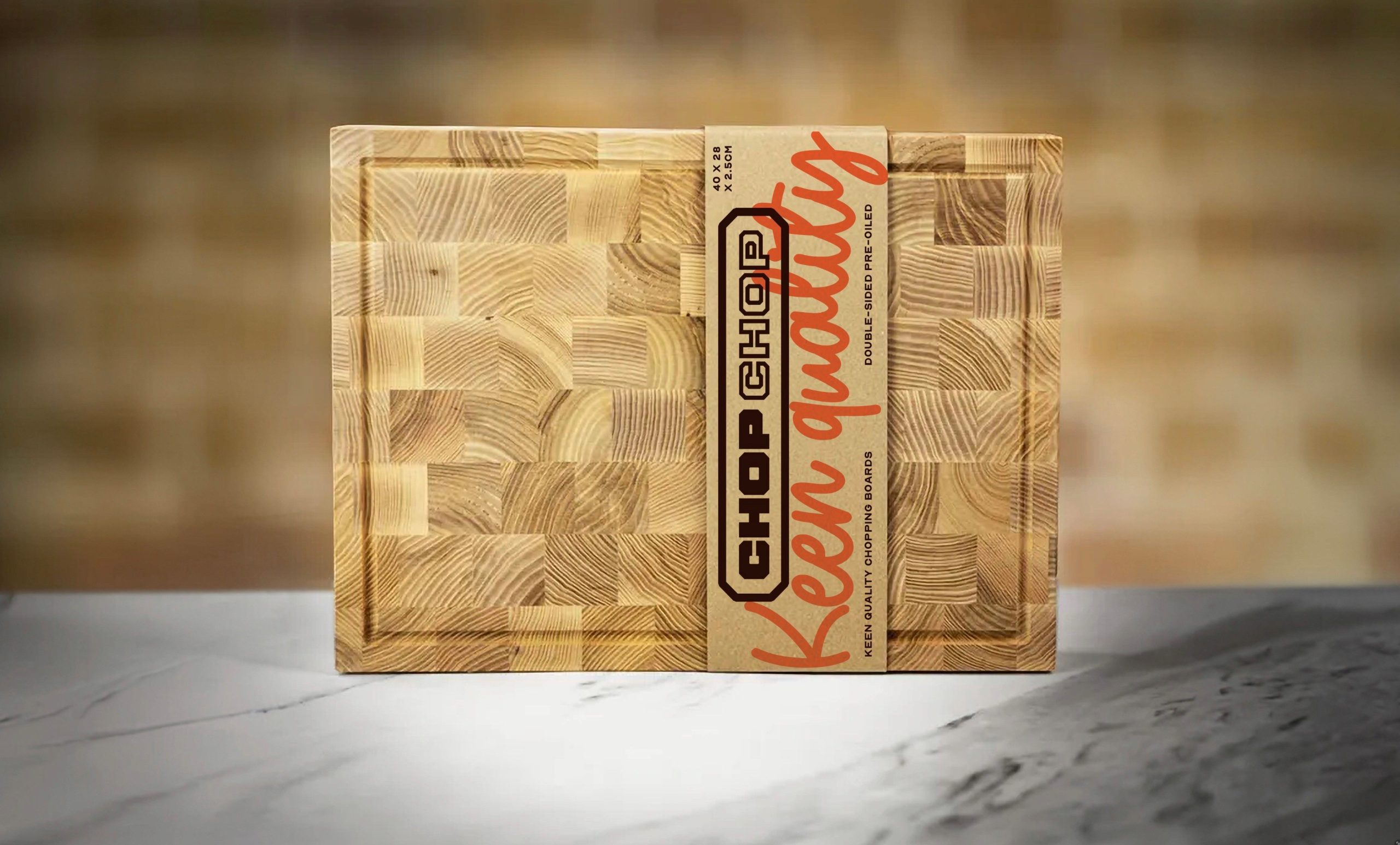
Chop Chop chopping board with branded packaging
01
The starting point
A UK chopping board company needed a brand for its high-quality products. The brief began with the name: finding a direction that would reflect the care in the product and give the business a recognisable identity of its own.
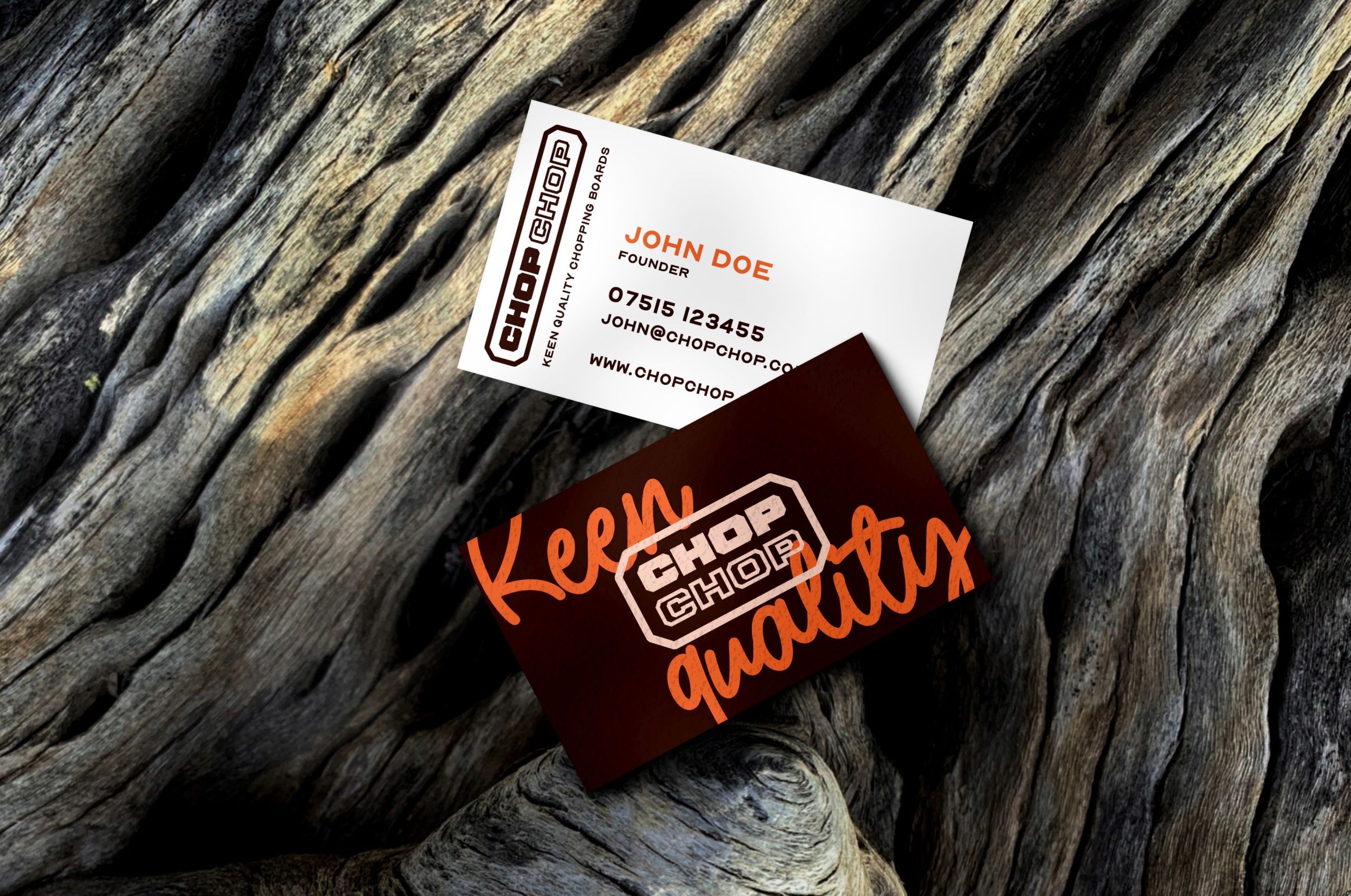
Chop Chop branded business cards
02
The connection
A range of naming options was explored before the client chose Chop Chop. The familiar phrase has an immediate connection to the kitchen. It is easy to say, easy to remember and gives a practical product a little personality.
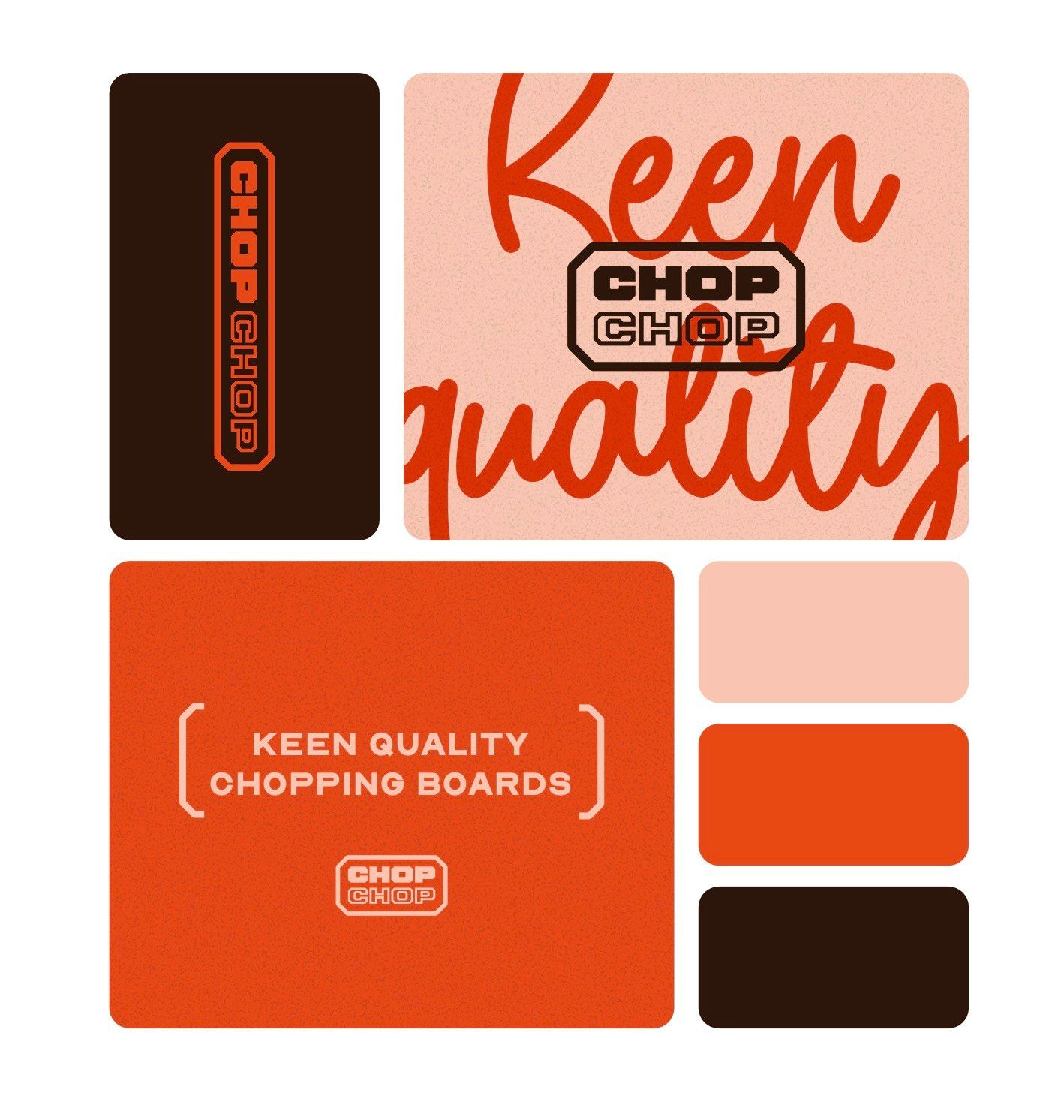
Chop Chop brand identity elements and typography
03
The design
The identity pairs a sturdy, outlined wordmark with expressive script. On the packaging, the two voices sit together: one gives the name structure, while the other brings warmth and movement. A narrow wrap leaves much of the timber visible, letting the material share the story.
04
Across the details
The project imagery shows how the same graphic language extends from the product wrap to stationery. The name, typography and restrained palette provide a consistent starting point for the brand, with the craftsmanship of the board still at the centre.
05
The work brought together
The case study connects the naming decision to the physical product and its supporting materials. The packaging gives the board a clear identity while allowing the timber to remain visible. Seen together, the applications show how a small set of typographic and graphic choices can carry a brand across several touchpoints.