
Selected work
Zero Pepper
Brand identity & logo design
An identity that puts a digital agency’s ambition into motion.
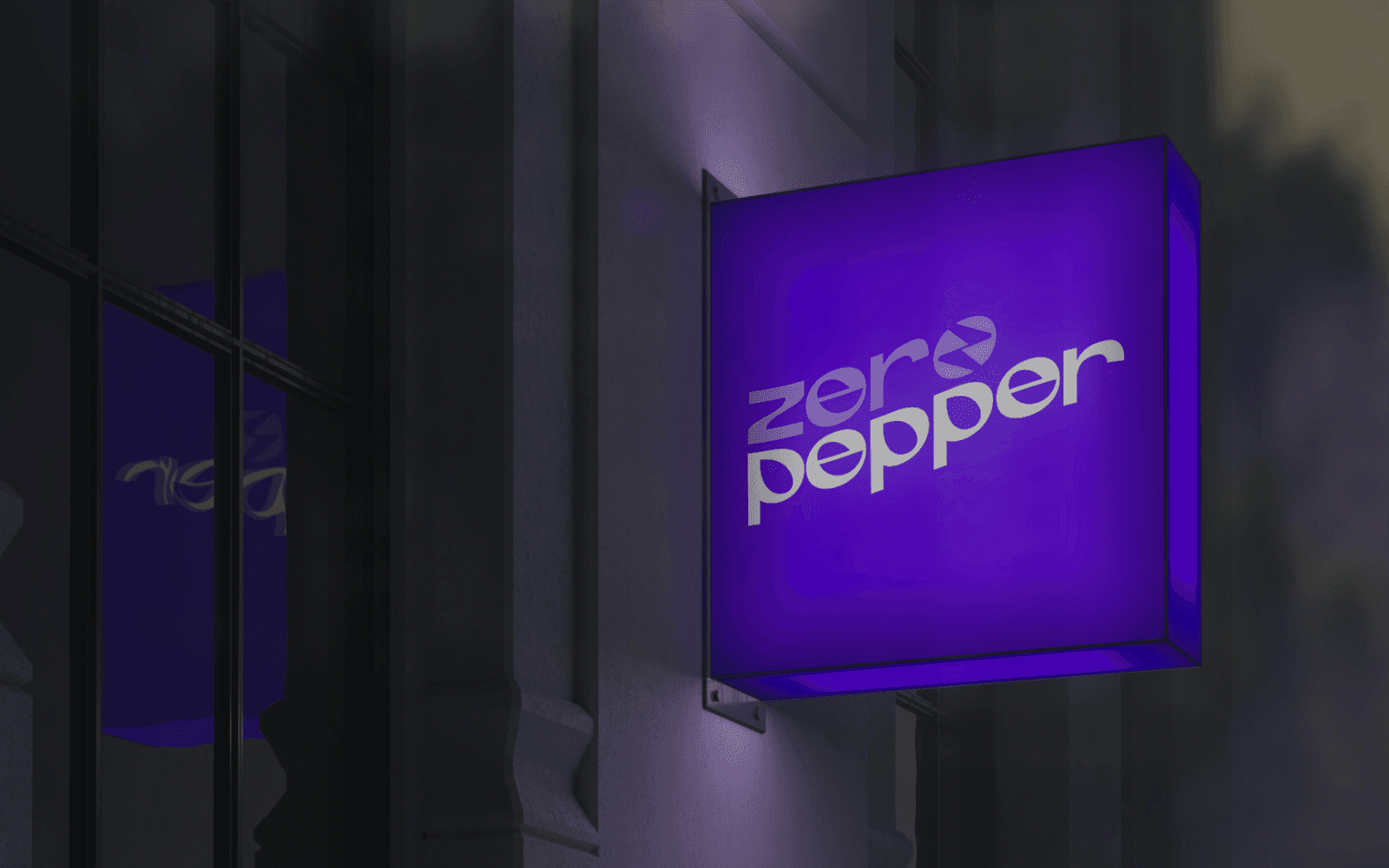
Zero Pepper logotype on an illuminated violet sign
01
The starting point
Zero Pepper helps businesses get found online. The agency commissioned a recognisable logotype, with the ambition to create a brand icon that could also be used independently. The identity needed to hold together as a full name and as a smaller mark.
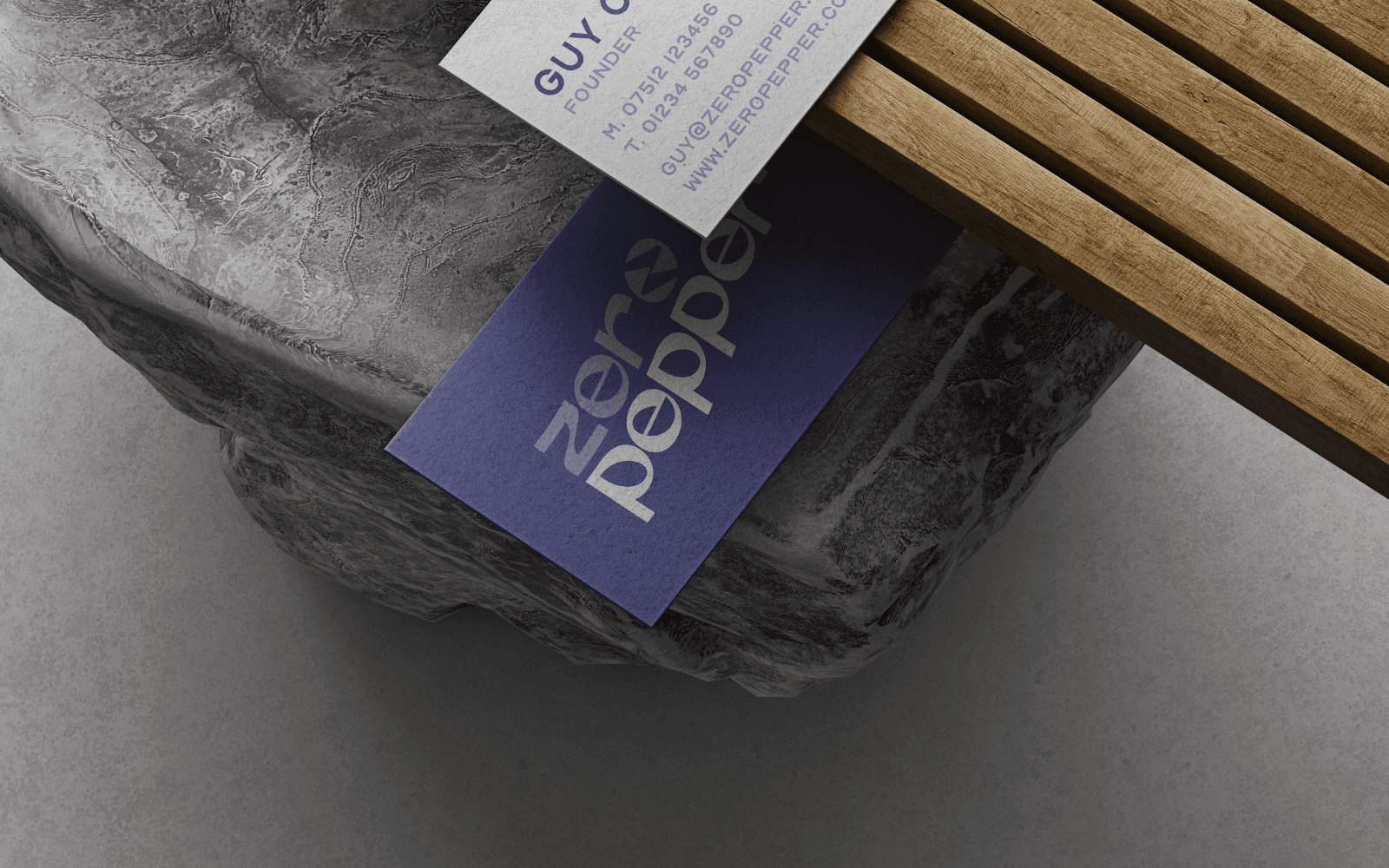
Zero Pepper business card designs
02
The connection
The design introduces upward movement into the typography, a visual reference to the agency’s work helping businesses become more visible. That sense of direction is built into the name itself, so the idea does not depend on a separate tagline or illustration.
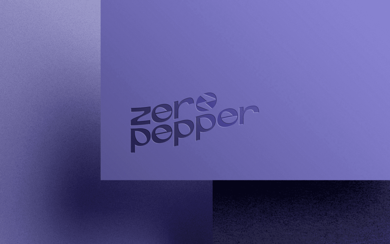
Zero Pepper letterhead design
03
The design
Rounded letterforms give the logotype a consistent character. An icon is incorporated within the wordmark, connecting the full identity to its compact expression. The violet and white treatment gives the shapes a clear contrast, as the signage application demonstrates.
04
Across the details
The published project includes signage, business cards, mugs, a desktop application and letterhead. These mockups show the identity at different scales and in different contexts, making the relationship between the logotype, icon and colour palette easy to see.
05
The work brought together
The project connects the agency’s full name with an independent icon, then tests that relationship across the applications shown. The shared shapes and colour help the identity remain recognisable from a small business card to an illuminated sign. The applications show how the same design idea carries through everyday business materials.